Featured

Adrian’s blog

(Photo by Jesse D. Garrabrant/NBAE via Getty Images)

Kobe Bryant of the Los Angeles Lakers poses with the NBA Championship trophy after defeating the Philadelphia 76er’s in game five of the 2001 NBA Finals at First Union Center on June 15th, 2001 in Philadelphia, Pennsylvania. One of the most well known Kobe photos, recently popularized further from his tragic passing. I think there are plenty of good qualities in this photo, it displays an iconic/epic moment in sports history. The lighting and contrast of the photo has a certain affect on the audience because of the old-school style almost. It’s above all also a photo without explanation, you can see a man honed in from the success he achieved from all his work, the championship trophy in his hand.

my audio journey

this was by far my most challenging of the gates we have done so far, during this gate a lot happened with the coronavirus outbreak that disrupted our class and somewhat my life, but it was cool learning how to use premiere (although it took longer for me to figure out than the rest). I had a lot of mistakes at first and would not save my work as often as I should that caused me to have to redo steps and even a whole task. overall it was a fun unit for me though and I am glad that now if I ever want to make some audio/digital footage of my own I know how to.

two logos

the logo is personal to me showcasing my favorite colors red and gold, my love for music through the headphones and I liked the deer antlers for a classy look to. it.
When I was in highschool I resold sneakers to make profit, and had a instagram page/website. This is something similar to what I would have used for a little logo to have for my profile pictures on social media, or on my website wouldve looked like.

Infographic

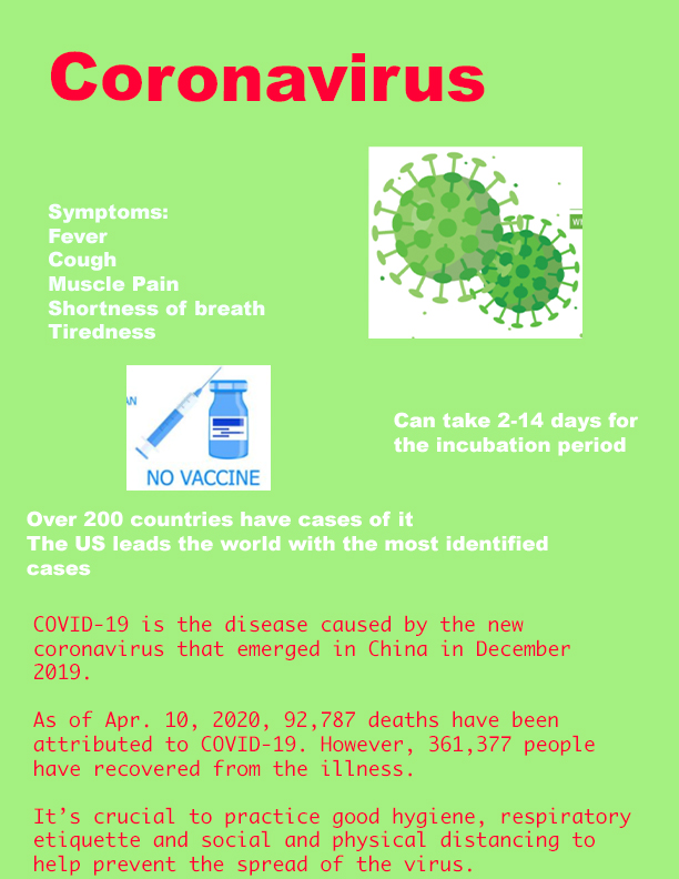
I made an infographic regarding the recent virus epidemic, coronavirus. In the infographic I go over the basics like symptoms for the virus, minor background info including the place of origin, the country with the #1 amount of cases (surprise it’s us!), I also included the tips given by W.H.O in order to hopefully prevent further spread of the virus and somewhat contain it.

Digital Reflections

The red on white box has a nice contrast to it which displays the brand name in white letters very well.
The same font is used throughout the entire name which provides for repetition.
It’s completely centered which goes with the alignment of the piece.
It has a very symmetrical proximity, with where the red box is centered and the letters within, the spacing from the borders. although I am not a fan myself, Supreme is one of the most recognizable brand logos in the street world of fashion and skating world.
There is a lot of repetition and contrast in the colors displayed. All of the pink parts are overlapped and have a symmetrical figure to them. The logo is at a centered alignment which makes it easy for everyone to identify the artwork. The contrast of the coloring is what I believe to make this such an effective piece, along with much of his other work that is highly sought after from athletes, celebrities and other artists.
There is a good contrast between the black outlines of the bears and their identifying colors. The bears themselves provide for repetition along with their facial expressions, also all being symmetrical, they provide a happy/positive vibe. It is center aligned and has the same space in between each bear, which are also all overlapping or connected through their arms. They have been used on shirts for concerts many times and seen inspiration on other variations of them.

Carolyn Davidson

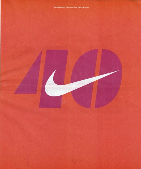
Brief background: Carolyn Davidson was born in 1943, in Carolyn was a student a Portland State University, at the time she was looking for graphic design work so that she could afford to pay for some oil painting classes on campus. One day passing on campus, Phil Knight heard her mentioning she needed extra cash so he had hired her for $2 an hour to work on some designs for his side business which would later come to be Nike. It took her 17 hours to come up with the designs we still see today all over those orange and white shoe boxes. After some time working with Nike, Davidson moved on to free lance work for herself.

The most famous of her work on one of the most recognizable brands of all-time, Davidson at the time was paid $35 for her monumental work, not knowing the impact it would have many years later on the world, at the time she drew up a few designs that CEO Phil Knight chose from, these were the two that primarily stuck. When Nike went public in 1983, Knight gave Davidson up to 500 shares of stock along with custom Nike Swoosh chocolate and a gold Swoosh ring to further commemorate her work. The originality of the logo is not supposed to be as simple as it seems, Phil wanted the logo to convey motion, to represent where the name “NIKE” came from originally, Davidson found it hard to think of something so simple that conveyed this trait, but after the 17 hours she had came up with what was bearable at the time, it took time for them to love the design, it paid off in the end.

I made Carolyn my graphic designer of choice because of the ties I have with Nike and shoes in general. Buying and reselling sneakers is something I did all through high school, sneakers were not only a hobby of mine but a way of income and also helped me learn how to conduct good business skills and further my people skills in semi-professional environments, I would travel to events around the country to sell my products and network. If it weren’t for Nike and their shoes, and others they have inspired I would not have got into that business, and with that I believe could have changed much narrative of my life including where I go to college even. I find the simplicity of the logo very appealing and the font of the original “Nike” phrase a very memorizable version of their logo.

Another piece of work Carolyn did for Nike in honor of the 40th anniversary of the famous swoosh being created, it follows the simplistic trend originally set.

Bracketing Test

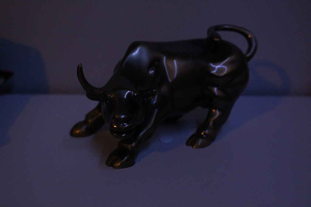
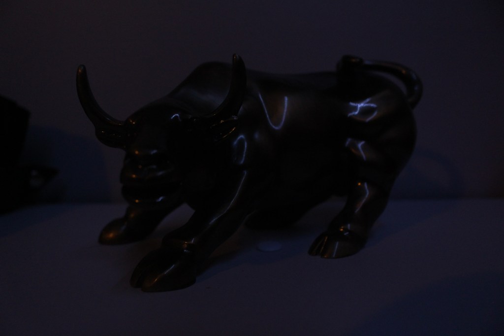
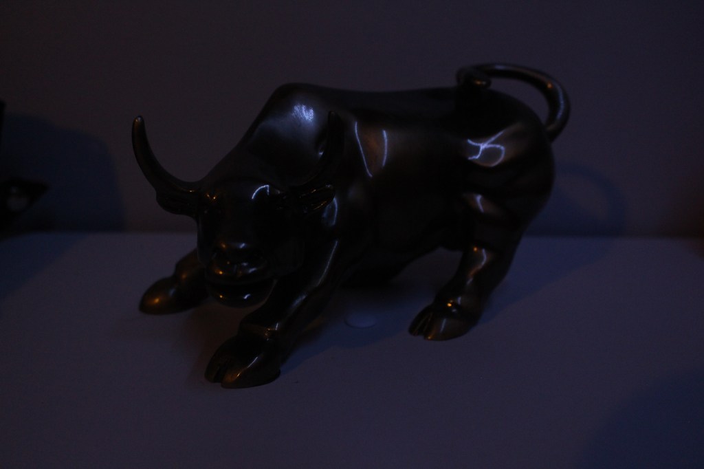
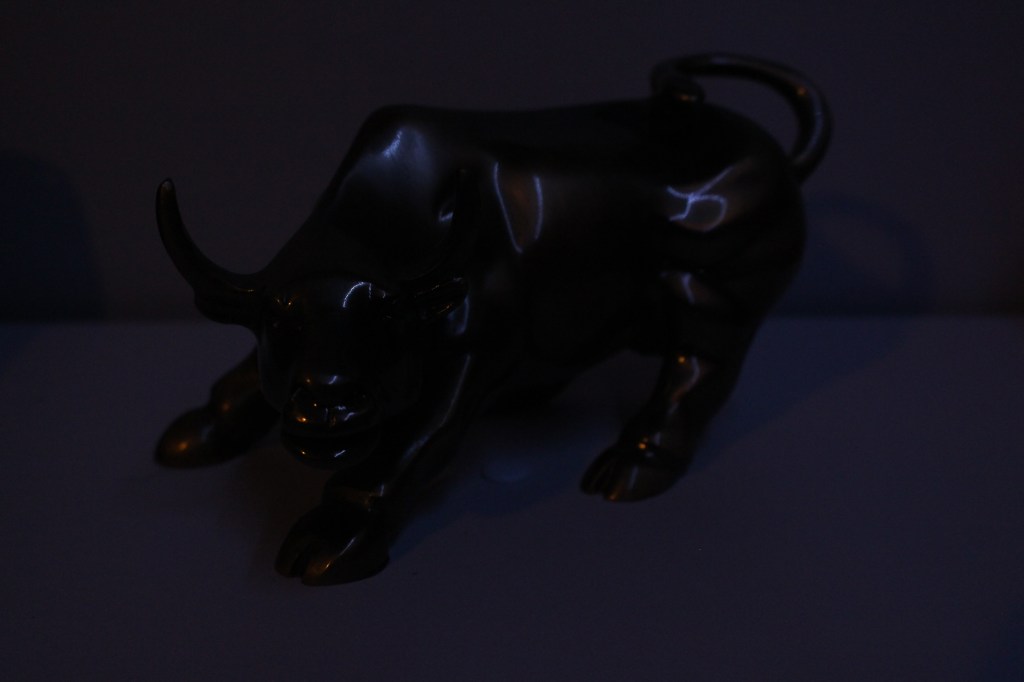
“In photography, bracketing is the general technique of taking several shots of the same subject using different camera settings. Bracketing is useful and often recommended in situations that make it difficult to obtain a satisfactory image with a single shot, especially when a small variation in exposure parameters has a comparatively large effect on the resulting image.” this task was about altering the triangle of exposure by changing one of the three elements.

F4,5 iso 3200 `160 ss
f4.5 iso 1000 160 ss
f4.5 iso1600 160ss
f4.5 iso 1600 200ss
f4.5 iso1600 125 ss
f5.p iso 1600 160ss
f4 iso 1600 160 ss

Design a site like this with WordPress.com
Get started