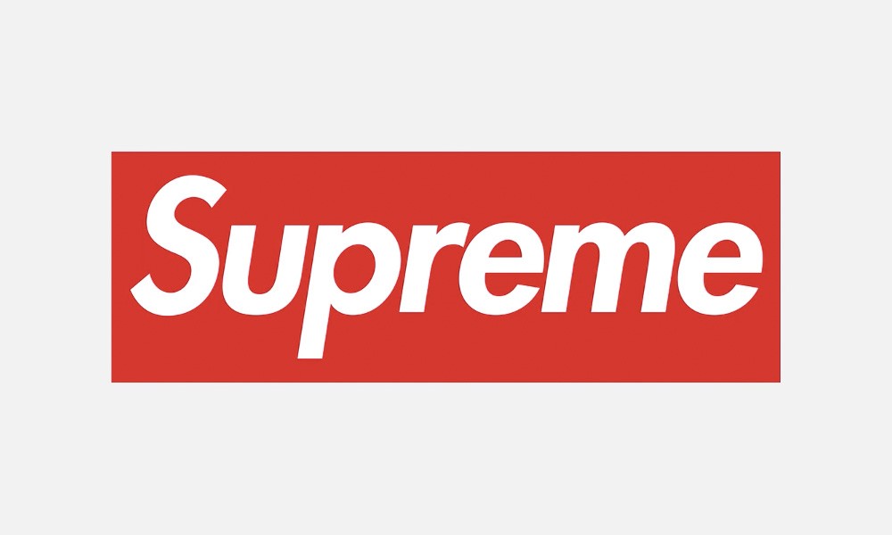
The same font is used throughout the entire name which provides for repetition.
It’s completely centered which goes with the alignment of the piece.
It has a very symmetrical proximity, with where the red box is centered and the letters within, the spacing from the borders. although I am not a fan myself, Supreme is one of the most recognizable brand logos in the street world of fashion and skating world.