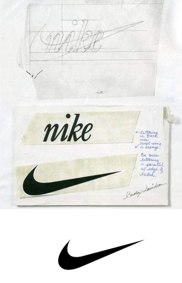
Brief background: Carolyn Davidson was born in 1943, in Carolyn was a student a Portland State University, at the time she was looking for graphic design work so that she could afford to pay for some oil painting classes on campus. One day passing on campus, Phil Knight heard her mentioning she needed extra cash so he had hired her for $2 an hour to work on some designs for his side business which would later come to be Nike. It took her 17 hours to come up with the designs we still see today all over those orange and white shoe boxes. After some time working with Nike, Davidson moved on to free lance work for herself.

I made Carolyn my graphic designer of choice because of the ties I have with Nike and shoes in general. Buying and reselling sneakers is something I did all through high school, sneakers were not only a hobby of mine but a way of income and also helped me learn how to conduct good business skills and further my people skills in semi-professional environments, I would travel to events around the country to sell my products and network. If it weren’t for Nike and their shoes, and others they have inspired I would not have got into that business, and with that I believe could have changed much narrative of my life including where I go to college even. I find the simplicity of the logo very appealing and the font of the original “Nike” phrase a very memorizable version of their logo.
